Known Pleasures: SVG line art
Recreating classic Joy Division album-art with SVG

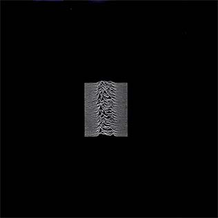
The cover art of Joy Division's debut album, Unknown Pleasures, is about as good as it gets. It's instantly recognisable and a perfect example of how a simple, abstract image can become iconic. And because it's both simple and data-driven, it feels like a great candidate for recreating with code.
After all, it's just a series of lines, right? And I've already written a lot about how to draw lines with SVG. How hard could it be?
Step 1: drawing a line
In my post on line graphs with React, SVG, and D3 I covered how to use D3.js to convert "real world" data into a format compatible with SVG's <path> element. To recap, the process is as follows:
Find the bounds of your "range" and "domain"
For both x and y axes, define the domain of your data (i.e. the minimum and maximum values) and the range of your graph (i.e. the width and height of the SVG canvas). The domain and range are the two things you need to generate a D3 "scale" function.
This example code assumes we're creating an SVG canvas that is 100px wide and 100px tall and dataset that is an array of ten random data points ranging from 0 to 10.
import { scaleLinear } from "d3";

const xScale = scaleLinear()
    .domain([0, 10])
    .range([0, 100]);

const yScale = scaleLinear()
    .domain([0, 10])
    .range([100, 0]);
Don't forget to flip the Y axis! SVG's coordinate system has the origin at the top-left corner, whereas most data visualisations have the origin at the bottom-left corner. If you don't flip the Y axis ([100, 0] rather than [0,100]), your graph will be upside-down.
Create a "line generator" function
Armed with your xScale and yScale functions, you can now create a line-generator function. This is a function that will convert an array of data into a string of M and L commands. These strings are how an SVG defines a line.
import { line } from "d3";

const lineGenerator = line()
    // Here we're using the index of the data point as the x-coordinate
    .x((_, d) => xScale(d))
    .y(d => yScale(d));
Build the SVG markup
We can then use this getPathData function to generate the d attribute of a <path> element in our SVG:
const data = generateRandomBellCurveData(40);
// [
//     4.761029986699451,
//     0,
//     5.327995603655005,
//     7.1660931217039066,
//     etc...
// ]

const path = lineGenerator(data);

console.log(path);
// "M0,1L12.5,50L25,20L37.5,30L50,35L62.5,70L75,100L87.5,90L100,30"
Generating "random" data I've written a small function to generate "random-ish" data that roughly follows a "normal distribution" (i.e. a bell curve). I won't include it here, but you can view my
generateRandomBellCurveData()function in this GitHub Gist.
<svg width="400" height="400" viewBox="0 0 100 100">
    <path d="M0,1L12.5,50L25,20L37.5,30L50,35L62.5,70L75,100L87.5,90L100,30"></path>
</svg>
<path> element.Step 2: applying margins to the graph
We might have successfully used some data to draw a line in an SVG, but there's still a long way to go yet.
One big difference between our simple line and the Unknown Pleasures cover art is whitespace. Peter Saville's graphic has lots, and ours has none.
Adding margins and padding to elements with CSS is very straightforward, but in SVG-land things are a bit more complicated. This is because our path element is defined in terms of absolute coordinates relative to the SVG canvas. If we want to add margins, we then also need to adjust the position of the path element. This can be achieved in a few different ways:
- Translate the path: This is the simplest way to move the path around. You can use the
transformattribute to move the path around. For example,transform="translate(10, 10)"would move the path 10px to the right and 10px down, allowing us to safely add a 10px margin to the SVG (by making the SVG's width and height 120px). - Use the
viewBoxattribute: This is a bit more complicated, but allows you to define a "virtual" canvas that is larger than the actual SVG element. If our path is drawn with x/y coordinates between 0 and 100, we could set theviewBoxattribute to"-10 -10 120 120"to add a 10px margin to all sides of the SVG. - Adjust the path data: This is the most complicated option, but also the most flexible. You could adjust the path data itself to add margins. For example, if you wanted to add a 10px margin to the top and left of the SVG, you could add
M-10,-10to the start of the path data or (and this is the approach I favour) you can adjust thexandyscales to add margins to the data before it's converted into a path.
"-100 -100 300 300"Step 3: stacking multiple lines
The next step is to "stack" multiple lines on top of each other. This is where things start to get a bit more complicated, as we need to generate multiple paths and then layer them on top of each other.
In code-terms, this means working with an array of rows, and then mapping over that array to get our path data.
// Create an array of ten items, each of which is an array of 40 points
const rows = Array.from({ length: 10 }, () => generateRandomBellCurveData(40));

// Run each row through the line generator to get the path data
const paths = rows.map(row => lineGenerator(row));
When rendering our SVG, it's easy enough to map over the paths array to generate multiple <path> elements:
Note: for the rest of this article will use
JSXfor rendering SVG markup. JSX is the React templating language, but React is not at all required for anything shown in this article. I just find JSX to be a more readable way to write SVG markup.
const pathMarkup = lines.map((line,i) => <path key={i} d={line} />);
But if we do this, we'd end up with all the lines aligned to the same baseline. Each line would bleed into the others and we'd be left with a mess.
What we want is to evenly distribute the lines across the canvas, so that they don't overlap. This could be done with a transform on each <path>, but a more flexible alternative is to let the yScale function do the heavy lifting.
The trick is to work out the baseline for each row, and then use that to generate a new yScale function for each row. The baseline can be calculated by dividing the height of the canvas by the number of rows and then multiplying that by the row index, which provides the px value for the bottom of each row. Feeding this into the range of the yScale in (where we had previously hard-coded 100) will then distribute the lines evenly across the canvas.
Offsetting the lines' baseline doesn't completely solve the issue, however. The lines themselves still are still the same height as the whole canvas. This means each successive line creeps more and more over the top of the graph's boundary. This is fixed by constraining the height of the lines, which can be done by setting the yRange to be a fixed height rather than the full height of the canvas. (For the example code, rowHeight is set to be 20px.)
const xScale = scaleLinear()
    .domain([0, data[0].length - 1])
    .range([0, 100]);

const rowGap = 100 / (data.length - 1);
const rowHeight = 20;

const rows = data.map((row, i) => {
    const rowBaseline = 100 - i * rowGap;
    const yRange = [rowBaseline, rowBaseline - rowHeight];

    const yScale = scaleLinear().domain([0, 100]).range(yRange);

    const lineGenerator = line()
        .x((_, d) => xScale(d))
        .y(d => yScale(d));

    return { line: lineGenerator(row), rowBaseline };
});
There's one last thing to be done to complete the effect, and that is to handle the "fill" of the lines. In the original Unknown Pleasures cover art, the lines are filled in such a way that they obscure each other. This is achieved by using a separate "area" for each line, rather than a single <path> element.
Instead of running the data through a "line generator" function, we can use a "area generator" function as well. This is similar to the line generator, but instead of just generating a line, it generates a closed path that fills the area between the line and the baseline.
A area generator is created in much the same way as a line generator, but uses D3's area function in place of the line function. The area generator allows us to define both a y0 and y1 function, which are used to define the top and bottom of the area. So the data (d) gets passed into y1 and the baseline (0) gets passed into y0, giving us a filled area between the line and the baseline.
const areaGenerator = area()
    .x((_, d) => xScale(d))
    .y0(() => yScale(0))
    .y1(d => yScale(d));
Then when the data is mapped over, we can generate both a line and an area for each row.
const rows = data.map(row => {
    // ...
    return {
        line: lineGenerator(row),
        area: shapeGenerator(row)
    };
});
And then when rendering the SVG, we can use both the line and area strings to render a line and an area for each row.
{
    rows.reverse().map((row, i) => (
        <g key={i}>
            <path className="area" d={row.area} />
            <path className="line" d={row.line} />
        </g>
    ));
}
Note the
.reverse()added to the data array. This is necessary to ensure the lines are drawn in the correct order. Unlike CSS, SVG has no concept of z-index, so source-order is king.
.line {
    fill: none;
    stroke: black;
    stroke-width: 1;
}

.area {
    fill: white;
    stroke: none;
}
Step 4: using real data
So far the chart has being using the pseudo-random data that generateRandomBellCurveData() spits out. To really recreate the iconic cover art, it would be great to use the actual data that inspired it.
Pulsar PSR B1919+21
The image is a visualisation of the first pulsar ever discovered, PSR B1919+21. The data was collected at the Arecibo Observatory in Puerto Rico in 1970, and the image was published in the scientific journal Nature in 1971. The image shows the radio signal emitted by the pulsar, which is a rapidly rotating neutron star. The signal is a series of evenly spaced pulses, which is why the image looks like a series of peaks and troughs.
How it came to be used in the cover art for Unknown Pleasures is quite the story and well worth looking into.
Getting the data into a JavaScript array was a quick task, but plugging it into the graph component required a bit of extra tweaking.
The graph was already calculating the offset for each line based on the number of lines in the data (const rowGap = layout.height / (data.length - 1);). So even though our original test data had ten rows and the pulsar data has eighty rows, the line-offsets worked nicely without any tweaking.
The same goes for the xScale, which was already by calculated based on the number of points in each row: .domain([0, data[0].length - 1]). Another freebie!
The yScale, however, needed a little attention. That scale was previously hard-coded to account for a minimum data value of 0 and a max of 100. To allow for any data, this needs to be changes to calculate the min and max values of the data and then use those to set the domain of the yScale.
const dataMax = data.reduce(
    (acc, row) => Math.max(acc, Math.max(...row)),
    0
);

const dataMin = data.reduce(
    (acc, row) => Math.min(acc, Math.min(...row)),
    Infinity
);
Using pixels in SVGs can be a bit weird. SVGs don't have an intrinsic unit of measurement, so when you define a width or height in an SVG the default unit is "user units", which are relative to the
viewBoxof the SVG. This means we can style an SVG line with CSS and set it to1px, but what's really being set is1 user unit, which could be any number of pixels depending on theviewBoxand the outer dimensions of the SVG element. Add a responsive percentage width to the SVG (which I always do) and suddenly the connection between CSSpxand rendered pixels in the final SVG becomes even less clear.
Owing to the fact there there are so many more rows in the real data than in our test data, the overall scale of the graphic had to be tweaked too. The SVG canvas was being defined as 100 which meant that a "1 pixel" width line was being rendered as a 1% width line. With 80 rows to consider, the final image was just a blobby mess. Bumping the scale of the viewBox up to 400 fixed this.
Bonus: different data
Having gone to the effort of making the graph component work with arbitrary data, the next obvious step is to throw other data sets at it and see what happens.
My daily step count (broken down by hour) actually works pretty well in this format.
A lot of the "fun" from these stacked graphs comes from having data that fits a couple of basic requirements:
- It looks best with lines that start low and end low, with a peak in the middle.
- The data should be noisy, but not too noisy. Each line should ideally overlap some of the others while still maintaining the general trend.
The original Pulsar data is a perfect example of these requirements, but that kind of data is surprisingly hard to find.
I thought weather data would be a great fit for this, and the UK's Met Office provides a Climate Data Portal that lets you download average monthly temperatures for any 2km square in the UK. I grabbed the data for my local area and, well, it doesn't quite look as good as I was hoping. The data is just too uniform.
In retrospect, I guess this is to be expected. There isn't that much variation in the temperature where I am right now and the temperature a couple of KM in either direction. To get a better looking chart, I should cherry-pick the temperatures from locations further apart.
To close the loop on this little experiment, it seemed only fitting to style the pulsar data to look as close to the original Joy Division album cover as possible.
Sources
I got a .csv of the Pulsar data from this Gist by Borgar, which I found in this D3 demo by D3-creator Mike Bostock which in turn I found via this excellent post that also recreates the Unknown Pleasures graphic using code. For what it's worth, I only found those posts when looking for the data after I'd written my code (although a LOT of my D3 knowledge comes from other Observable demos by Bostock).
I learned a lot about the history of the original graphic from this fantastic article in Scientific American, which also contains some great dynamic visualisations that explain how pulsar data is collected and interpreted.
I got the idea to embark on this project by seeing this TikTok which was made by the author of the Scientific American article referenced above, Jen Christiansen. Thanks, Jen!
Related posts
If you enjoyed this article, RoboTom 2000™️ (an LLM-powered bot) thinks you might be interested in these related posts:
Line graphs with React and D3.js
Generating a dynamic SVG visualisation of audio frequency data.
Similarity score: 77% match . RoboTom says:
Stacked Sparklines web component
Turning an SVG chart into a general purpose web component
Similarity score: 75% match . RoboTom says: